Xbox Cloud UX Design
Project type
Ergonomic UX Design
While working as a Game Designer at Xbox Cloud Gaming, I partnered with AAA, AA, and Indie studios who were developing games for the Xbox platform. Working with developers and publishers, I would learn the games' design intent and brand product goals to decide the scope of each of my designs. I would also find released games that were good fits for the program and pitch designs to the studios.
As I learned everything about the game, I would design, test and implement touch control layouts. I designed the core inputs to be ergonomic and, for complex games, would add special functions to enhance the players experience. When applicable, I would write up artist briefs for custom icons (from our illustrator or the studio artists) and implement the assets.
Case Study 1

Gameplay Familiarity
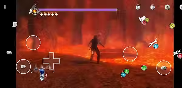
With Ninja Gaiden 1, 2, and 3 I was challenged to design three different touch layouts, that felt the same. were best for each individual game, while making them familiar for players. Each layout is different, but they all share core informational imagery and match the expected controller icons.
Input Stress Test
Gameplay and input complexity vary greatly from game to game, but Team Ninja makes complexity an art form. While this challenge is appreciated by many console and PC gamers, mobile players would normally be required to purchase addition hardware to interact with the game. With TAK, I was able to make every combination of inputs possible.


Case Study 2


Immersive
Eiyuden Chronicle Rising was the first game that I was assigned and while there are reasons for some games to have more informative icons (like in image 1), it would have been too high scope to create the dynamic icons needed for this one. I championed more stylized touch controls.
We later received thanks from players who thought that the controls (image 2) were native to the game.
Animated
We got to have extra fun with Splashteam, on Tinykin! Once again, informing each icon was out of scope, but this time, we were able to add extra flavor by animating tinykin characters to pop out from behind buttons when the buttons were pressed.


Case Study 3

Brand Matching
From one Assassin's Creed to the next, some things stay the same, and others are wildly different. Origins and Odyssey are no exception to this. While the controls are mostly the same, the iconography changes dramatically. We worked closely with Ubisoft to ensure that their clear branding and informative icons.


Case Study 4

Simple & Clean
Some core loops don't require many inputs. Few require as little as Vampire Survivors. Keeping half the buttons out of the way, and optimizing for opacity, I earned praise from a streamer, saying that Vampire Survivors was more fun to play with TAK than with native touch.

Case Study 5

Form meets Function
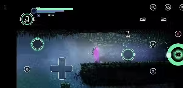
When designing a TAK Layout for Ghost Song, it was very important to me to match the feel of Old Moon's (Matt White) hand-crafted world.
There was also a great opportunity here to include some added functionality. Specifically when it cam to using a charge attack. You can't jump, while holding the attack button, without clawing your hand over the screen, but with the pull action (in image 3), players can hold down Y and jump and tine their attacks perfectly.


Case Study 6


Seamlessly Cinematic
You don't want your cutscenes inhibited by UI (or to have to go searching through settings every time one comes up). This is especially true for games like Ni No Kuni (where the many fans come for the Studio Ghibly style and the story) and GRID Legends (with its live action story).
For these I included buttons at the top of the screen to hide and reveal the TAK layout.


